
It works like a magic!
As a trader, I found this tool useful for spotting market trends and making informed decisions. The real-time data and clear chart patterns help identify potential trade opportunities.
INSTANT DOWNLOAD!
Original price: $199.00 (one year lease)
Your price: $18.00 91% OFF Retail!
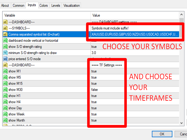
Content: Indicator: Supply and Demand Dashboard PRO_4.2.ex4 (Unlocked-Unlimited), UserGuide.
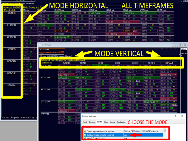
The Dashboard Offers a Comprehensive Overview
-
Displays filtered Supply and Demand zones with zone strength ratings
-
Shows pip distances to and within each zone for precise trade planning
-
Highlights nested zones to easily identify confluences
-
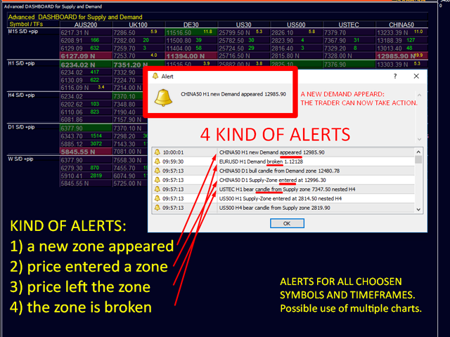
Provides four types of alerts across all 9 timeframes for selected symbols
-
Highly configurable to suit your personal trading preferences
Your Benefits with Our Supply & Demand System
Answering the Most Important Questions for Every Trader:
🔹 Where are the best levels to enter the market?
Enter trades within or near strong supply/demand zones to maximize your chances of success and achieve optimal risk/reward ratios.
🔹 Where should I place my stop loss?
Position your stop loss just below a strong demand zone (for buys) or above a strong supply zone (for sells) to minimize risk.
🔹 What is the ideal profit target?
Your exit strategy is as critical as your entry.
-
For buy trades, target the next higher supply zone.
-
For sell trades, aim for the next lower demand zone.
Enter on a pullback to a supply/demand level to ensure there’s enough room for a solid profit margin up to the next zone on the higher time frame.
Why Filter Strong and Weak Zones?
Not all zones are equal. The greater the imbalance between buyers and sellers, the stronger the price reaction.
High-probability zones are those where price reversed sharply without warning — revealing where large numbers of sellers or buyers overpowered the market.
By filtering out weak zones, you focus only on levels where major imbalances occurred — increasing your chances of catching powerful moves.
Advanced Features and Dashboard Highlights
Smart Alerts
The system provides four powerful alert types to keep you informed in real time:
A new supply or demand zone has appeared.
Price has entered a zone.
Price has exited the zone.
The zone has been broken.
You can refine alerts to trigger only for nested zones, choose which timeframes should generate alerts, and exclude specific symbols if desired.
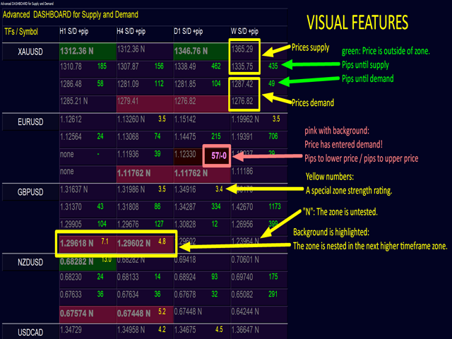
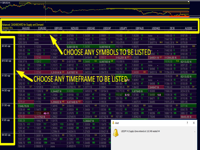
Dashboard Visuals
Prices for supply and demand zones are clearly displayed: supply upper price, supply lower price, demand upper price, and demand lower price.
Pip distances to the nearest supply or demand zone are shown in green when the price is far from the zone.
Pip distances within a zone are displayed in bold pink when the price has entered the zone, showing pips to the outer and inner boundaries.
Zone strength is indicated by a yellow number once a minimum threshold is met.
A label “N” marks zones that are new or untested.
Background highlighting indicates nested zones within higher timeframe zones.
If a zone is both nested and new, supply and demand prices are shown in bold for quick recognition.
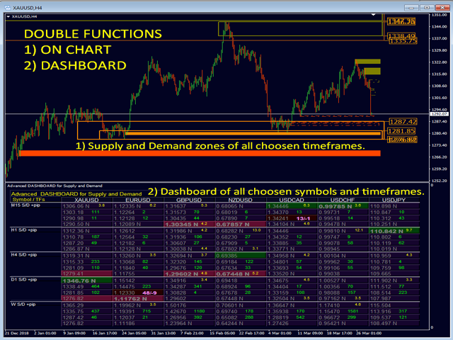
Chart Visuals
On the chart, you’ll see clear visual cues for supply and demand levels, including zone strength, test status, nesting status, and price positioning, giving you an instant understanding of the market structure.
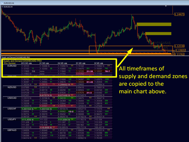
Simply drag the dashboard sub-window downward with your mouse to view the actual chart. Click any symbol name to switch the chart to that symbol.
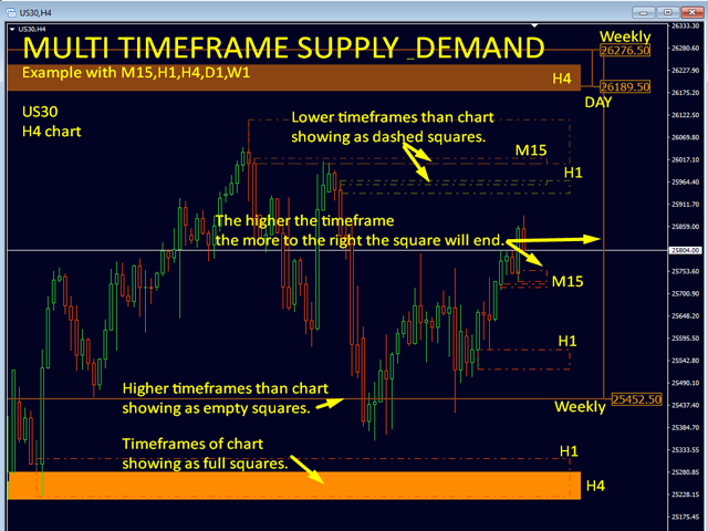
All timeframes visible on the dashboard are drawn on the chart.
Dashed squares represent lower timeframes than the chart.
Full squares represent the chart’s current timeframe.
Empty squares represent higher timeframes.
The higher the timeframe, the further to the right the square appears.
Color coding indicates whether a zone is new or tested.
You can choose whether or not to display prices directly on the chart.